I’ll never forget the moment a client called me, panic in their voice: “We need to run a spring campaign. When can we launch?”
“Great!” I said. “What’s the goal?”
Silence. Then: “Well… it’s spring. We should be marketing.”
In my 19 years working in Digital Marketing, I’ve heard this conversation more times than I care to count. Data-driven decision making has become the ultimate buzzword in marketing, but here’s the uncomfortable truth: most agencies and marketing teams aren’t actually doing it. They’re just saying they are.
The real kicker? At Bluetrain, we’ve been shaking our heads about this for 18 years. When we started back in 2007, being genuinely data-driven was revolutionary. We were among the first agencies to refuse running campaigns without proper analytics in place. No SEO work, no social media, no paid ads – nothing – unless we could measure it.
Today, everyone claims to be data-driven. But claiming and doing are two very different things.
Here’s what I’ve learned: true data-driven decision-making isn’t about having more data – it’s about asking better questions, collecting the right metrics, and visualizing them in ways that actually drive decisions. In this article, I’ll show you the three pillars that separate teams who make genuine data driven decisions from those just throwing around buzzwords, and how the right dashboards can finally bridge that gap.
The Mad Men Problem Still Exists
We’ve gone from the days of Mad Men – where you could only track awareness surveys and eventual product sales – to an era where literally everything is measurable. When you run a Google ad, you can see how many people saw it, clicked it, what they did next, and whether they bought something. If you’re marketing for a restaurant, you can even track how many people scan the QR code for the menu in person.
Yet somehow, we still have the same problem: marketing for the sake of marketing.
The issue isn’t lack of data – it’s lack of purpose. And that’s where most marketing teams fall apart, despite having access to more data than ever before.
The Three Pillars of Actually Being Data-Driven
True data driven decision making depends on three things: Good Questions, Good Data, and Good Visualizations. Miss any one of these, and you’re just pretending to be data-driven while flying blind.
1. Good Questions: What’s The Point?
Being actually data-driven means you need to be goal-oriented. It starts with a simple exercise that most marketers skip: you have to ask yourself “what is the point?”
What is the point of this Instagram campaign, blog post, landing page, or partnership? If everything goes perfectly, what would the best result be?
Reality check: It is NOT realistic to think you’ll make one blog post that leads to $10,000 in sales.
It IS realistic to say: “We’ll write this blog post to show people that data-driven marketing depends on Good Questions, Good Data, and Good Visualizations. This will showcase our expertise and the goal is for people to download our Google Analytics dashboards and book a consultation.”
See the difference? One has a clear purpose and measurable outcome. The other is just marketing because it’s Tuesday.
Teams will say they want to make data driven decisions, but then launch campaigns without any KPIs to measure success against. You can’t optimize what you don’t measure, and you can’t measure what you haven’t defined.
2. Good Data: Beyond Basic GA4
Next comes measuring that goal. You’re looking for the BIG ACTION (meetings booked), but also micro-conversions like people clicking links to our dashboards and making copies for themselves.
The basics: GA4 installed on your site. The ideal: actual event tracking.
Getting GA4 on your site is great but limited. You can see that there was a form submit, but you can’t tell which form or location. It also doesn’t track small micro-conversions, like how users interact with menu items or buttons.
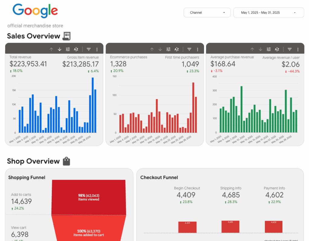
Check out our e-commerce dashboard – it goes beyond basic GA4 by tracking the entire customer journey from first touchpoint to final purchase, including product performance and customer lifetime value. That’s the kind of granular data that actually drives data driven decision making.
3. Good Visualizations: Look at Your Damn Data
So did the campaign do what we wanted? Hard questions, sometimes hard answers, but always something you can learn from.
We’ve definitely had blogs go live and fall short. Having the tools to visualize and understand why helped us adjust and turn around campaigns that were initially duds.
The key is presenting your data in a way that makes campaign results crystal clear.
While GA4 has made Google Analytics reporting better, it’s limited to just website data. This is where Looker Studio shines – think of it as Google’s free dashboard tool that lets you pull data from dozens of sources (Google Analytics, Google Ads dashboard, social media platforms, Google Business dashboard, you name it) and combine it all into beautiful, interactive visualizations.
When we’re measuring the success of this blog, we’ll be looking at:
- Google Search Console to track how we’re ranking and if people are clicking
- Instagram, Facebook, and LinkedIn metrics to understand the impact of our initial posting
- GA4 to see how far down the blog people scrolled and what they did next
- Calendly data to see if our writing was convincing enough for you to book a consultation
Our data driven dashboard is another perfect example – it tracks not just surface-level metrics, but dives deep into how campaigns perform across channels, what’s driving actual purchases, and where your marketing spend delivers real ROI. Most marketing teams get stuck looking at isolated platform metrics, but this dashboard shows the complete business impact across the entire funnel.
The Social Media Reality Check
Speaking of social media, let’s talk about where data-driven decision-making goes to die. So much in social media feels disconnected from actual business results – you can see follower counts, likes, and engagement, but it feels impossible to prove how these metrics support your business bottom line.
Instead of setting unrealistic goals like “this social media campaign must generate sales,” we set realistic goals: “This campaign will build trust and familiarity with potential customers, getting them to sign up for our newsletter or download our guide.”
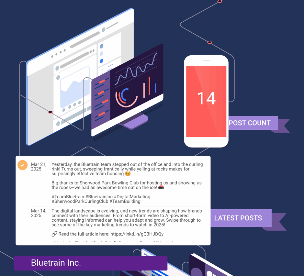
Our LinkedIn Posts Feed dashboard is perfect for this – imagine heading into a board meeting when your CEO asks, “How’s our LinkedIn presence doing?” Instead of scrambling through the platform, you can pull up a clean, professional Looker Studio dashboard showing your latest posts, total post count, and top-performing content all in one view.
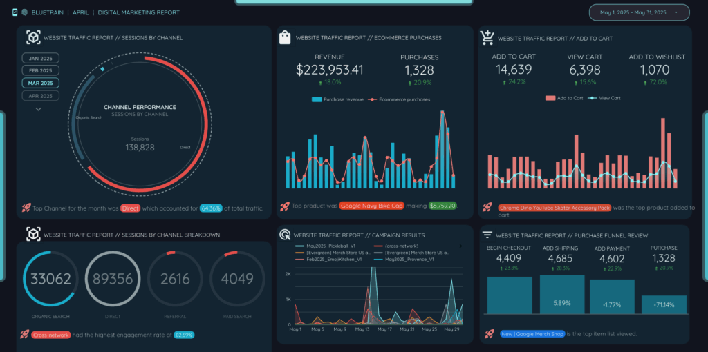
That’s the power of good visualization: having the right data, at the right time, for the right people. They can be as simple as this LinkedIn dashboard or as detailed as our comprehensive dashboard showing campaign results, channels, and purchases.
Why Most Teams Still Get This Wrong
Even with all the tools available, most marketing teams struggle with true data-driven decision making because they:
- Confuse activity with strategy – “We should be running newsletters” instead of “What do we want people to do after reading our newsletter?”
- Focus on vanity metrics – Follower counts feel good but don’t connect to business outcomes
- Don’t connect their data – Instagram analytics live in Instagram, Google Analytics reports live in GA4, and never the two shall meet
- Don’t ask hard questions – When campaigns fail, they move on instead of digging into why
The Bottom Line
Here’s what 18 years of actually being data-driven has taught us: the difference between successful marketing teams and everyone else isn’t access to data – it’s the discipline to ask the right questions, collect meaningful data, and visualize it in ways that drive real data driven decisions.
Every campaign should start with “What’s the point?” Every dashboard should answer “Did we achieve our goal?” And every analysis should end with “What do we do differently next time?”
The good news? You don’t have to build this from scratch. Look at our Looker Studio dashboard to get some ideas on what to track or where to start. This will help you set a foundation for actual data-driven decision-making, not just the buzzword version.
Ready to stop pretending and start actually being data-driven? The data is waiting. The question is: are you ready to look at it honestly?
Want to see how this approach could work for your organization? Book a free consultation to explore the potential that proper data visualization has for your marketing efforts. And hey, if our dashboards don’t convince you, we’ll look at the data, see where we lost you, and adjust. That’s what good marketing is.
This article was written in collaboration with Claude